MercuryOS, a speculative reimagining of the operating system by designer Jason Yuan, serves as a glimpse of the future and a more humane take on human-computer interaction.
Inspired by an iPad prototype developed using SwiftUI by the talented Rauno, I embarked on a journey to recreate a similar experience for the web.
Adapting this concept for the web presented a thrilling challenge, particularly when it came to implementing touch gestures. While I didn't quite get it working perfectly, I learned a lot in the process. In this blog post, I present a demo showcasing my progress.
Although the web version may not match the iPad's seamless fluidity, what I was able to achieve for a web design is very cool anyway. Developed using NextJS and Framer Motion, it incorporates many of the animations and touch gestures seen on the iPad prototype. The browser version leverages many scroll snapping techniques and smart use of the Intersection Observer API to make it work.
Note: At the moment, this demo exclusively supports the Safari browser, but the future of web development seems very bright if it continues to evolve and web-based page transitions continue start to become more widespread.
The Challenge of Responsiveness
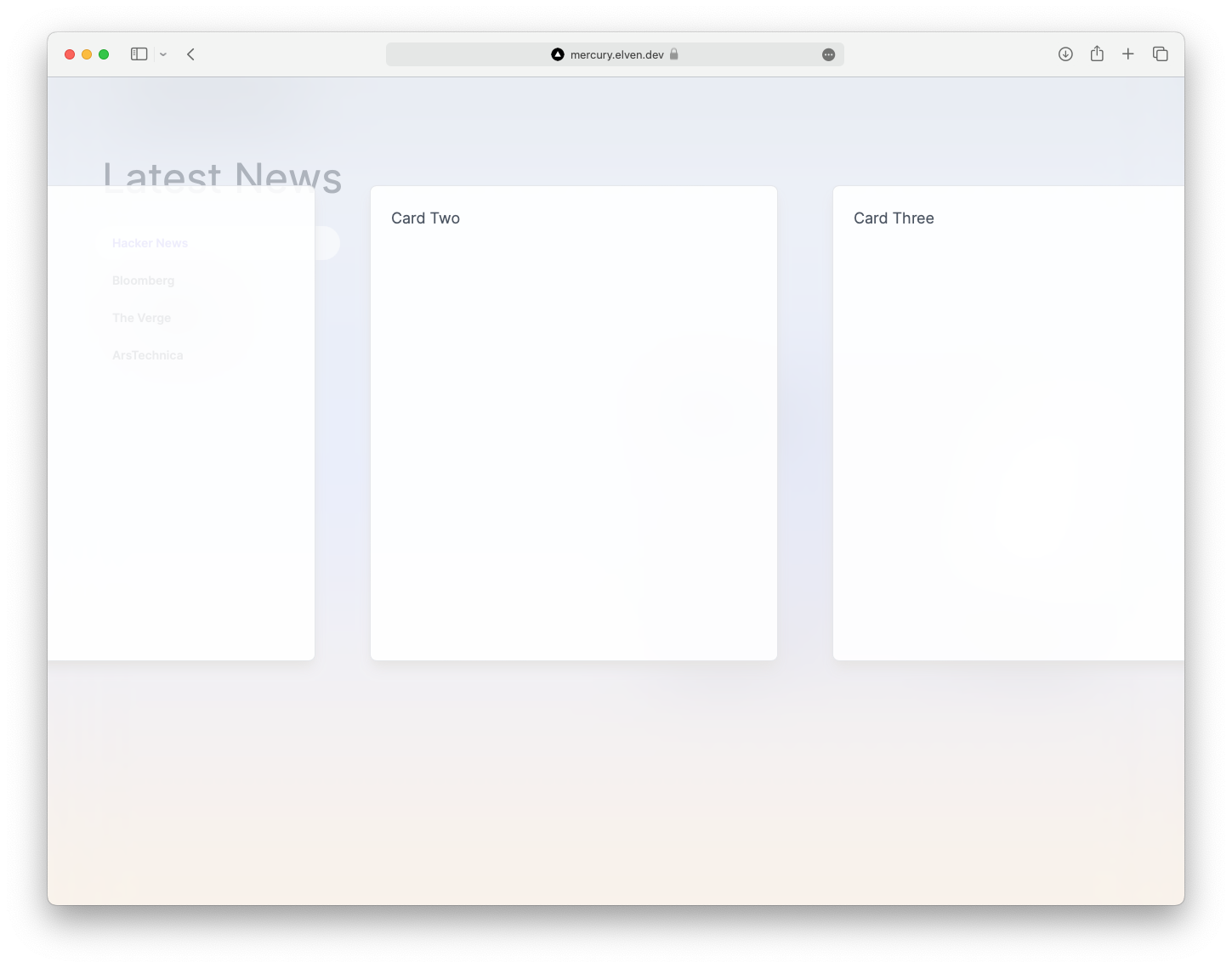
MercuryOS shines on an iPad, but achieving a responsive design introduced new hurdles. Notably, rendering a preview of each card while scaling them down posed difficulties on the web. The high-resolution displays of iPads might simplify this task, but for now, I've left the cards empty to keep things straightforward. As I'm still learning Framer Motion I didn't want to complicate the animation process too much for the demo.
Another key consideration was maintaining consistent aspect ratios when animating and expanding the cards. This approach ensures smoother animations, preventing disjointed resizing during transitions.
However, adapting the design for mobile screens presented its own set of challenges. I soon discovered it was difficult to fit the card and card contents on the smaller screen size without overflow issues.
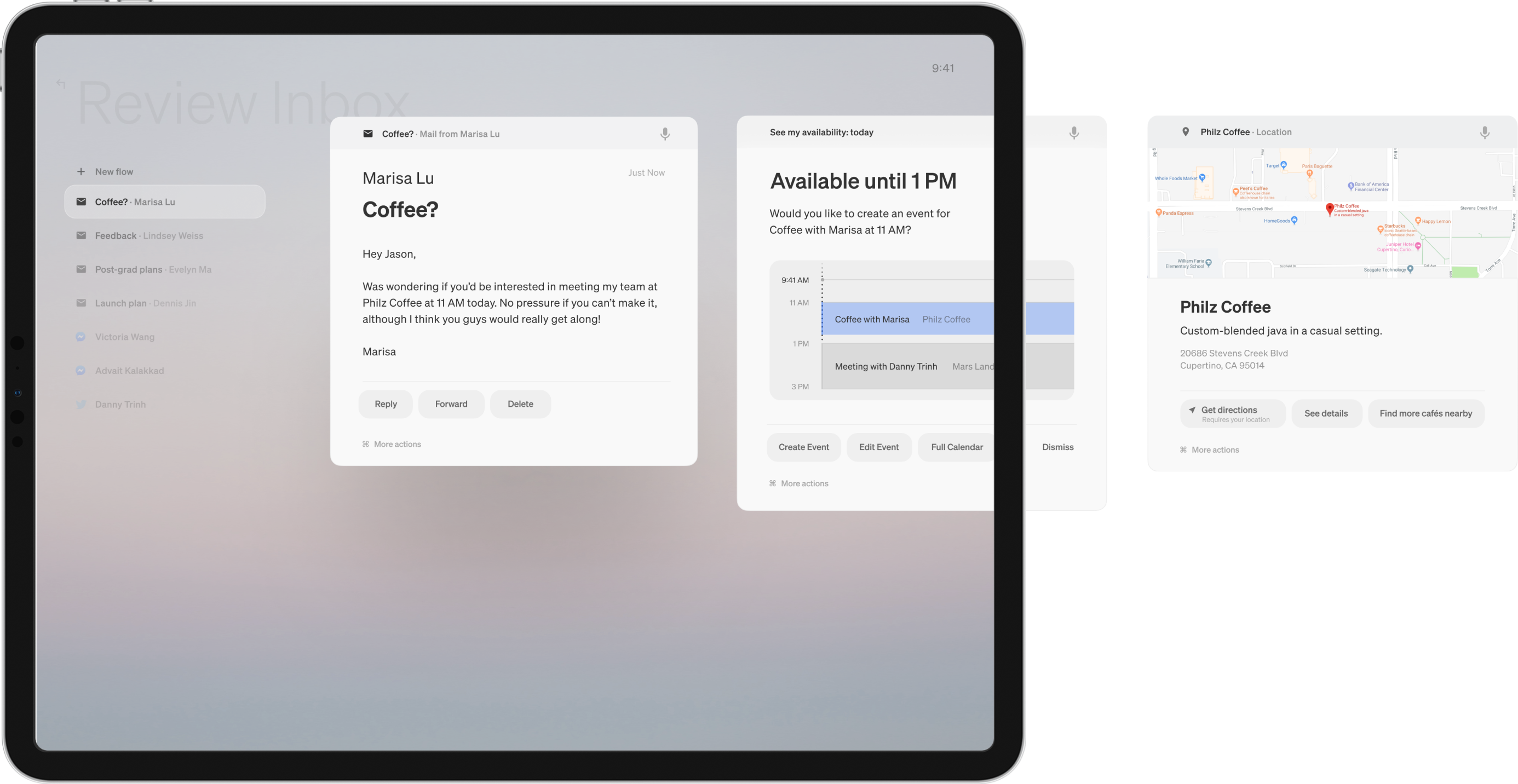
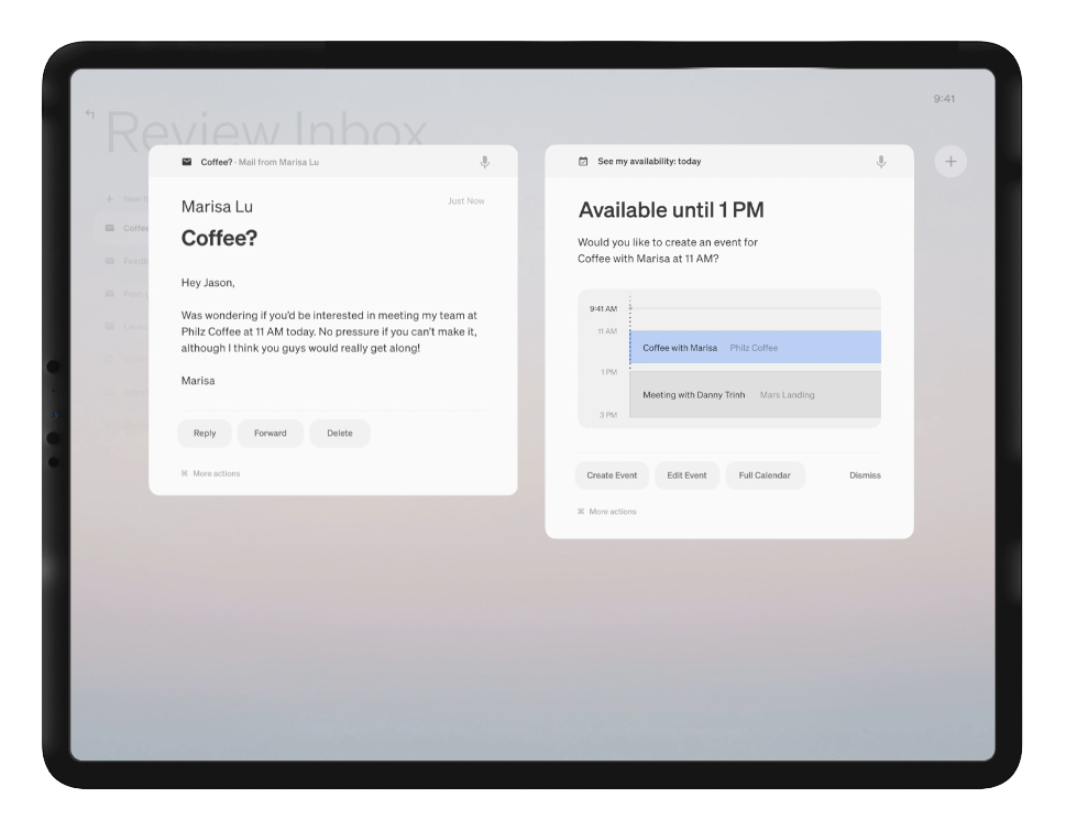
In MercuryOS, new cards are added to a "flow" and appear on the right-hand side.
Translating this to the web became intricate due to vertical scrolling with snap points for flows, coupled with horizontal scrolling for multiple cards in a flow. So we've got two overlapping scroll areas to deal with (which is possible) but adding touch gestures and dragging to the background in addition to that became very complicated. To simplify interaction, I restricted card dragging to the vertical axis while enabling background dragging and adding a double-click option to exit active flows – a more intuitive desktop solution.
If you're scrolling through cards horizontally it'll also cover up the table of contents on the left-hand side.
In the picture below you can see that MercuryOS was designed to work that way, but in practice its a bit more difficult to actually use on web, particularly with touch gestures and scrolling.
This layout also had some issues on mobile screens because the table of contents would immediately be hidden by the expanded card. My initial idea was to convert the table of contents into a select input box on mobile, but it looses some of the magic that makes MercuryOS look so good. If you opened this up on a mobile phone for the first time it would be hard to figure out that you can drag cards up and down to move between flows, as it's not an intuitive or easily discoverable UX feature, especially if the table of contents was hidden.
Another consideration was stacking multiple cards on top of each other, akin to a physical deck. While this approach may solve some issues, it introduces new UX complexities and interferes with card manipulation. Additionally, the expanded cards on mobile could be presented as full-screen or as a drawer, but these options may hinder multitasking, which is a core aspect of MercuryOS. Maintaining adequate padding around cards for touch interaction on the background also introduced further complications on smaller screens.
Content Presentation Challenges
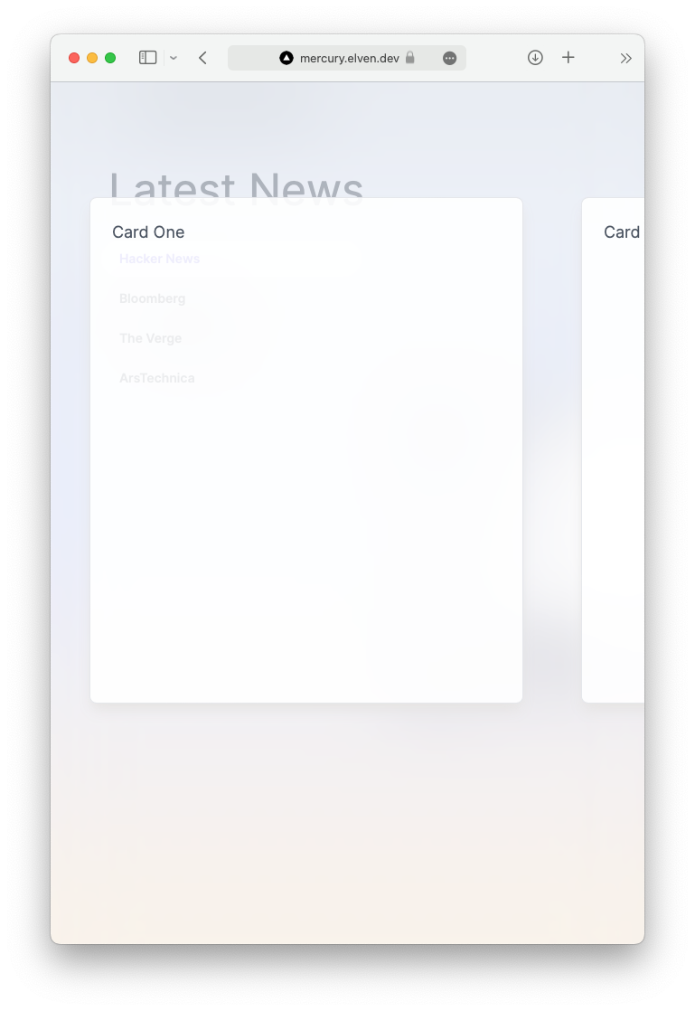
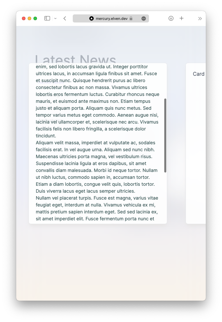
Maintaining the aspect ratio of cards led to issues with overflowing content, requiring inner scrollbars for card content. This setup introduced challenges when transitioning from dragging the card to scrolling inside it. Striking a balance between card size and content proved tricky, especially on smaller screens.
It was a compromise of having extra long cards that resized during the animation, or using overflow-scroll. If the card was too long on a smaller screen it would end below the fold and make it feel strange to scroll vertically between cards and different flows, as the scroll snapping for flows was set to the height of the browser window.
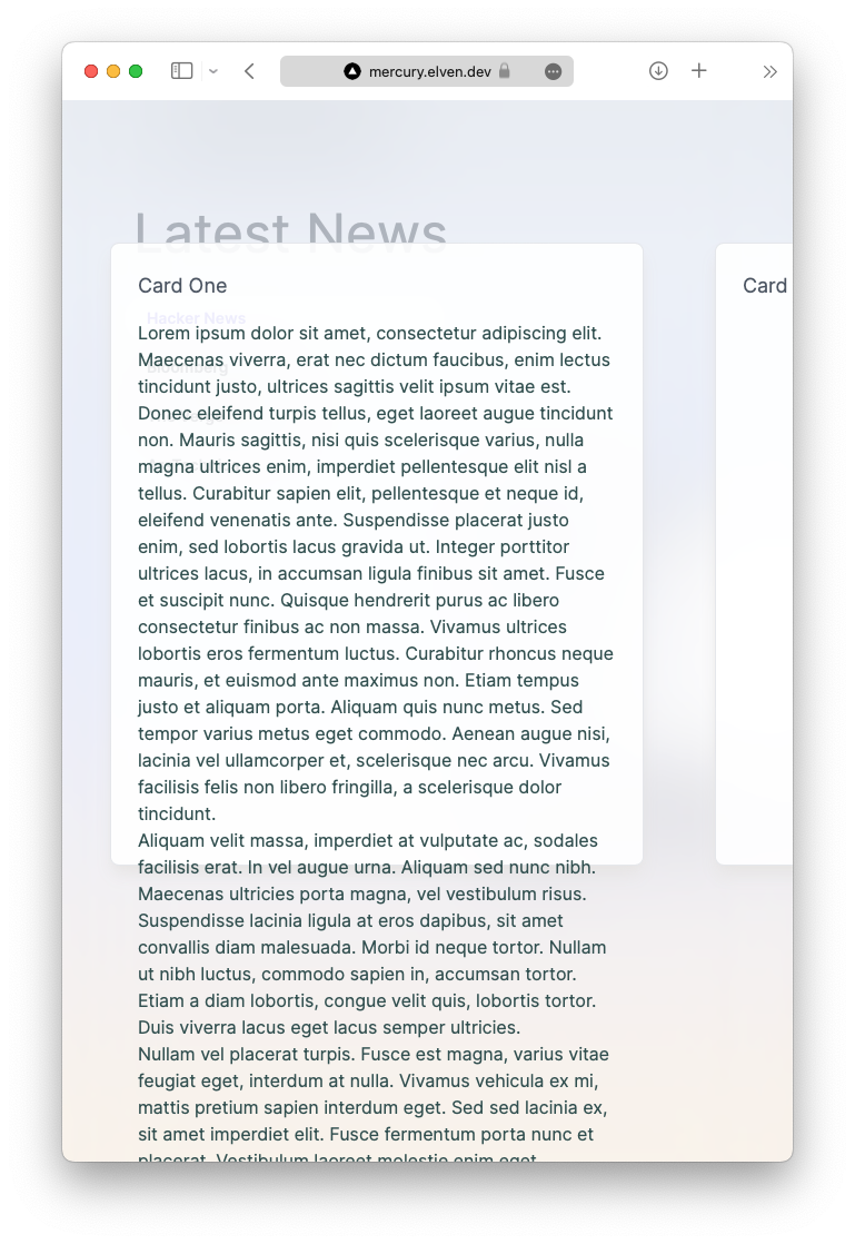
That obviously doesn't work but creating the animation from a small preview card to a larger card isn't smooth when the card size or aspect ratio is changing. Comparatively, using overflow-scroll resulted in a cleaner appearance but posed challenges for touch gestures, potentially leading to accidental card closures or navigation errors.
The design for overflowing content as seen in this example from the MercuryOS website looks great, but everything seems nicer when you have a large iPad screen to work with and you don't have to worry about responsive design. And I'm not trying to downplaying or knock the MercuryOS concept that Jason created, it was designed with a different purpose and wasn't meant to be translated to a responsive website. These are just my own comments from a web developers perspective.
Animation and Performance
Animating fine details, such as body text on the cards or displaying scaled-down text, proved challenging. Scaling text within a confined space on the browser can be particularly tricky, and text animation is especially difficult if the text is resizing during the animation process, as it wouldn't be a GPU-accelerated animation... so I left that for another day.
While the animations excel on Safari, they may appear less fluid on other browsers. Compatibility between browsers seems like a big hurdle for this design.
Gestures and Interactivity
Implementing touch gestures was primarily accomplished using Framer Motion, with additional support from @use-gesture for pinching and pinch-zoom functionality on touchpads. I spent a long time getting the touch gestures to work well on Safari only to realise the it didn't work well on all browsers. Safari seems to be the winner here again.
Conclusion
My exploration of building a MercuryOS clone for the web was a fascinating experiment, offering valuable insights into the world of web animation and touch gestures. While I ran into a lot of challenges, this journey was educational and has me hopeful for the future of web design. Who knows, maybe we'll see even more exciting and interactive websites in the years to come?
To try the MercuryOS web demo for yourself, visit mercury.elven.dev using Safari on your desktop.